Monument Post Mortem
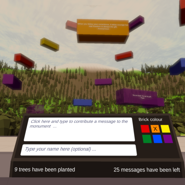
Monument was my entry for the 2017 Rainbow Jam. My goal with Monument was an ambitious one. I wanted to create a relaxing world that the player could visit where they could see messages of kindness and positivity and hope left by others and leave their own message. And I was going to do this in two weeks … while working full time during a very busy period. In this post I’m going to break down the development process and look at the key events, how those events impacted the project and what I’m going to do differently for next time.
Coming up with the concept
The theme for the 2017 Rainbow Jam was ‘spectrum’ and there were a range of diversifiers (optional aspects people could incorporate) that I was interested in trying to include. In particular one of the diversifiers involved building a game that only used the colours from one of the flags associated with different facets of the queer community. Coming up with a concept that fit these though was a challenge.
I knew from the start that I wanted to make a game that sent a positive message but I wasn’t certain on how to execute that. Initially my ideas centred around the fact that different colours in the well known 6 colour Pride flag are associated with particular things (eg. red for life etc). That led into my initial idea of having an environment split into 7 sections. 6 of those sections would correspond to the different colours and be themed around the meaning associated with that colour. The player would collect something from each of those environments and bring it back to a central area.
The idea looked great, at least it did in my head, but it had a lot of problems. From an aesthetic point of view it was well beyond what I was capable of creating solo and I didn’t know what the game was actually trying to say. There wasn’t a clear point to what the player was doing. This caused a lot of frustration and I took some good advice and took a short break.
My next idea was what became Monument. I had the idea of this monument in the middle of an environment that the player would interact with. And the environment would have a persistence to it with contributions from the player and from people around the world. The monument would be a place where people could read positive messages from others and could contribute their own positive message. And the environment itself would be one that the player could explore and relax within. Finally I had an idea that I felt was communicating what I wanted and was within my skillset. There were areas that were going to push me outside of my comfort zone still but a lot of the areas I had a clear understanding of how to approach.
My big takeaway from this was actually to be patient with myself. The initial failure to come up with a good idea really made me question myself and my ability to create a game with meaning. Luckily I had someone to remind me that I could do this and had done it before. I think the real source of the problem here was trying to push too far out of my comfort zone. Monument was a good compromise of something that would push me but still overlapped with areas of familiarity. It’s something I’ll keep in mind for future projects. I’ll still be open to ideas completely outside of my experience but try to manage the frustration of them not being viable better by recognising that they are a far larger step outside of my comfort zone.
Creating the level
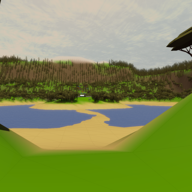
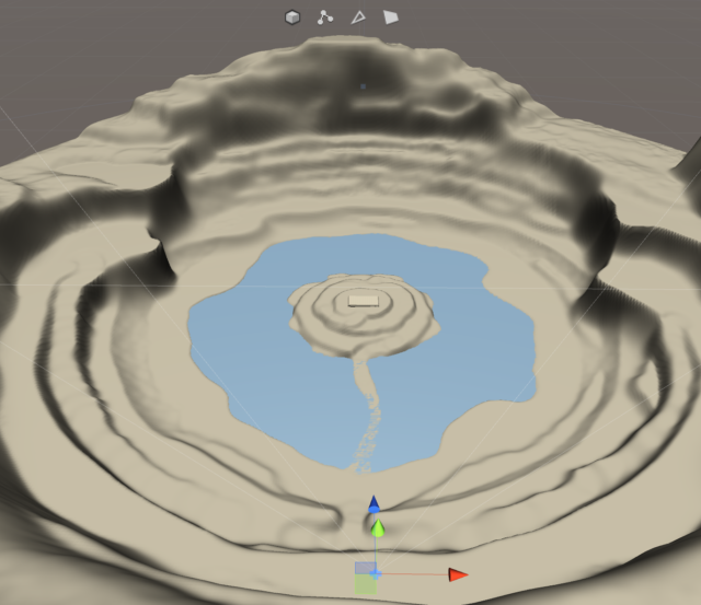
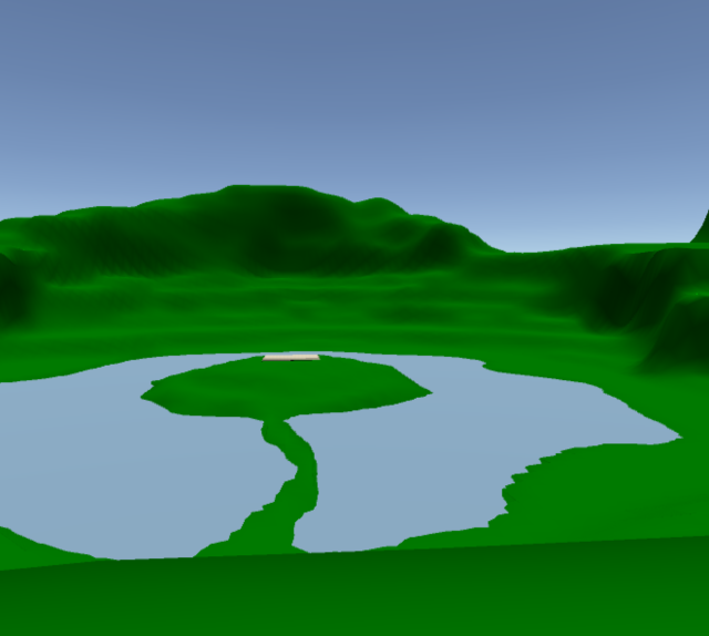
Now that I had the concept for Monument locked down the next challenge was the level. My plan was to go for a low poly environment and to generate that by first crafting a terrain using the terrain system in Unity. I’d then, through code, automatically convert that into a low poly mesh. I knew the rough shape that I wanted for the environment. I wanted a crater that contained a lake with an island in the centre which would be a home to the monument itself.
In my head I knew what I wanted the level to look like but then turning that into an actual terrain was a challenge. My level design experience is very limited and so I fell back, to heavily, on what I knew which was procedural generation. I started to try and generate the terrain fully using that method and while it worked for the broad shape of the terrain for such a specific environment it wasn’t a good fit and it caused a lot of frustration. After a lot of iteration I had a rough layout that I felt would work well.
Using that layout I was able to create the rough shape of the terrain and I experimented a lot with using the tools to finally get a workflow that worked. In the end what I did was block out the large features of the level (island, paths etc) first at very fixed heights. Then I’d create large steps down between the areas by sampling the height at intermediate points and setting blocks of the terrain in that area to that height. That created my large feature areas with big blocky steps in between them. I then went for using some smoothing and some slight noise to rough up the terrain a little and blend between the regions. The final stage was to do some more small features by sampling heights on the slopes and extending them out in a few places.
The end result was a terrain that looked how I wanted and in the process I learned a lot not just about using the terrain tools in Unity but in how to approach the design of a level. My mistake was that due to a lack of experience (and thinking) I was trying to create the entire level in one go at the macro and micro levels and that just wasn’t feasible. I needed to change my work flow to generate the big block features first and then refine down to the smaller details.
Creating the low poly terrain visuals
I knew with the terrain that it was likely that I would need to be making tweaks and modifications to the terrain during development. I also needed to be able to colour the terrain appropriately (sand at low altitudes, snow at high altitudes and rocky areas on the steep slopes). This meant that options such as exporting the terrain into a 3D modelling program weren’t an option. There were various plugins that were available but I felt it was something that I could write the logic for myself.
The script ended up being quite simple. It samples the heights and from that generates the vertex and triangle information necessary to create a mesh asset. In the process I learned it was possible to, in code, save the created mesh asset which would mean the code would not need to run at runtime. I could run it once, save my mesh, and not use the code again. The process worked well and it helped that this was an area I had previously had experience with. On some projects in industry I had needed to generate geometry from a set of height information so I remembered the various processed I had to work through for that.
To achieve the correct look in terms of colouring for the terrain I went for a vertex colour based approach. I was able to assign the vertex colours during this generation stage. It mostly used height for doing the bulk of the calculations but it then also looked at the slope and would blend into a rocky colour for steep slopes that were not in the sand or snow zones. Overall the process worked well and I had a system that would give me a suitably coloured mesh asset and didn’t need any runtime code to support it.
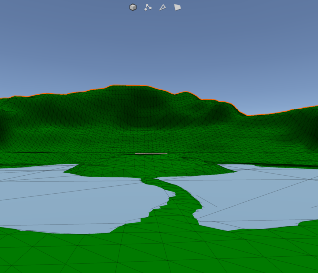
But I wasn’t done. I didn’t just want the terrain to have big blocks of the colours. Even with the lighting suitably setup the visual effect was not what I wanted. The terrain looked too much the same. What I wanted was to have a slight wireframe look. This was wear the ‘fun’ started. I could do a vertex coloured terrain and I found resources for applying a wireframe visual. I needed something that combined both. That meant I was going to need to write a shader.
Shaders are well out of my comfort zone and this was going to be the most complex shader yet. I couldn’t use a simple surface shader. I needed to use a mix of geometry, vertex and fragment shaders to achieve the desired effect. I started with the wireframe shader here. With that I then modified it to support vertex colours. So far so good. But it didn’t support lighting … or shadows 🙁
Luckily there are some great examples provided by Unity (see here) for exactly that. It was a painstaking process but I was able to progressively adapt the shader to support everything I needed. In the end I now have a shader that provides vertex colouring, a subtle wireframe, lighting and can receiver shadows.
What did I learn from all of this? A lot, about a lot of things. I have a much better understanding of how to implement different effects in shaders. I also have some great resources now to be able to easily create low poly environments and to render them in a particular manner. The shader was easily the most frustrating part but I finally feel like I’m now developing a better understanding of how they work and how to create the effects I want.
Building the monument
In the beginning my concept for the monument was, as you can see in the image below, to have it be a boxy building reaching towards the sky with individual bricks containing the particular messages. I developed along those lines a significant way and fully setup a system that could programmatically determine where to place each individual brick to construct the building. Once I started to see how it looked in game though there were some issues.
The first problem was the number of bricks required. In order for the monument to be visible at a distance or to be of any substantial height there would need to be hundreds of bricks. I wanted the game to start with a monument already well established which would have meant I needed hundreds of messages to start. It was clear that was not going to be viable as by that point I’d only assembled around 20 messages. The second problem was that the monument was static. This was a static environment with a static monument. The only movement came from the water and when placing a tree. That made it feel too still. The monument felt more sombre than I had intended. The final problem was if I did end up with a lot of messages how would people read them all? I’d need to either move the blocks periodically or procedurally generate platforms and stairs to allow a player to move vertically.
I knew I needed to redesign the monument and I wanted to incorporate movement. It had to meet some interesting design challenges though. I needed it to move but to be able to scale up in such a way that it could expand to accommodate more bricks and that it could do so at any point in time. I also needed to ensure the bricks fully circulated so that someone could be able to see, with patience, every message that was left. The solution I came up with was to have the bricks move up what was essentially an invisible sphere. The blocks orbit around the centre of that sphere and move upwards at the same time.
The blocks keep track of their azimuth and elevation angles (which are used to calculate where they are in the world). That allowed me to tie the transparency of the blocks to their elevation angle. The blocks start transparent and as their elevation increases become more solid. Then as the blocks reach their highest point they fade out. This allowed me to teleport the blocks from the top of the monument to the bottom without the player noticing.
This was working well but there were still two issues. The monument was too wide and still did not move quite in the way that I wanted. The solution here was to squash the sphere. What happens now with the monument is it has a fixed radius when calculating the horizontal position and a variable radius when calculating the vertical position. As more blocks are added the monument becomes less spherical and more ovoid in shape. The final addition was to include a slow sinusoidal variation on the horizontal radius. That makes the monument almost appear to be breathing as the blocks circulate up into the sky.
The final result is one that I’m really happy with. The monument has a sense of life to it and allows all of the messages to be seen and it also grows as more messages are added. I’m not sure what my lesson from this is though. It didn’t push me out of my comfort zone in terms of techniques or design. The main learning from this one was to try things in game as early as possible. The first monument style was one I stuck with for a very long time without trying it with actual messages or looking at how many blocks it needed to be effective. If I’d tested it sooner then I’d have realised a lot earlier it was not a good fit. Moral of the story: test user dependent features in game using as close to real data as early possible.
Planting the trees
From the beginning I wanted the player to do more than just wander through the environment. I also wanted to have some basic interactions. Originally my plan was that there would be static trees that were always present and dynamic trees. Those dynamic trees would be ones that the player could place and which the game would remember had been placed. I also originally planned to have it that as more people around the world planted trees more of those dynamic trees would be pre-populated.
It was an interesting idea and it presented some cool tech challenges but it wasn’t interesting from a design point of view. I’m a big believer in not adding things that a player will never realise are there. And in this case pre-populating more trees because others in the world had done so? Very unlikely to be readable to the player. I cut that idea before it began but still kept parts of it in that the information about trees being planted is sent to the server and displayed on the central monument.
I feel that gives a nice blend of letting the player know that many people are interacting with the world and that they’re part of something bigger than themselves and bigger than what they’re seeing. The big lesson from this was a reinforcement really. A feature being cool to the developer isn’t a reason to include it. If it’s cool to the player then include it, otherwise scrap it.
Gathering messages
I very specifically did not want the game to start without any messages. For one thing if a player did not have network connectivity then they might then never see anything other than their own defeating the point of the game. For another if there are messages there to start I felt people would be more inclined to contribute and it helped set the tone of what was expected in the messages.
My solution here was to setup a google form and share it via social media to try and source as many responses as I could to begin. That worked well and I ended up with around 30 for the game at launch. I did curate the messages and continue to do so for any new ones. People can put any message they want in *their* game but their message only gets to other people’s games after I’ve reviewed it.
I wanted to avoid any messages that were hate speech or that attacked others. I also wanted genuine quotes from the people submitting the message rather than quotes from famous people. I think the results speak for themselves with this. There have been some amazing and beautiful messages contributed by people that mean all the more because it comes direct from those people rather than some well known quote. Naturally there were also joke messages some people submitted (and continue to submit). I just filtered all of those out.
Understandably an argument could be made that I’m engaging in censorship here and it isn’t something I take lightly. I’m very careful when deciding if a message should or should not be included. Sometimes I’ll check with other people if I’m on the fence regarding a message. Fortunately the majority of messages have either been suitable or very obvious joke messages so the process has been simple.
Going forward though I do wonder if there was more I could have done to avoid people including joke messages. It’s possible that people did that not thinking it would be a reason to reject their message. My instructions focused on prevent hate speech getting into the game rather than avoiding joke messages. It’s something that I think I’ll have more of a sense of over time as people can now see example messages in game as a reference.
The final final builds
So I left creating my first build until Saturday afternoon. The game was due 9am on Monday. If you pause right now and listen the sound you’ll (hopefully) hear is a very loud chorus of my students yelling “I told you so”. Building early and building often is advice that I routinely give to my students and that I absolutely did not follow. I don’t have a good reason for it other than overconfidence. This was not my first game jam and definitely not my first game and so I was overconfident and figured it would be all fine.
It wasn’t and I very rightly got the karmic smack to my development timeline I deserved for not following my own advice! Everything broke. First my terrain shader broke. The editor had silently been working around several errors which then build immediately got very cranky at me for. That cost me a bunch of time but on the plus side I have a way better understanding of how to debug shaders and what to look for next time.
Then my audio broke and only in a build. It would play correctly until there was a scene transition and then it would immediately stop. Thankfully an upgrade to the latest Unity integration of WWise fixed it. Then I ran into another bug where the initial resolution selection dialogue wasn’t being suppressed …. on MacOS only. So that required a quick rush to set up a decent image for it. There wasn’t time to work around the bug so this was the best option.
What did I learn from this? FOLLOW MY OWN DAMN ADVICE! These problems caused a lot of stress and a lot of rushing that would have entirely been avoided if I had tested sooner. And I might have been able to fix the resolution selection issue. And the time wasted at the last minute I could have spent relaxing or adding in more polish. I need to follow the advice I give others and do regular builds. This was just inexcusable arrogance on my part and it’s a lesson I’m hopefully going to remember.
Conclusion
At the end of all of this I made a game … in 2 weeks and during a period when things were very very stressful. The game itself really pushed my limits and I learned a lot in the process. I’m incredibly proud of the game and if you’d like to check it out then it’s available here.


